
A new visual identity is on its way, but the same mission continues
PI is launching a new brand in 2020, with a clearer focus on reimagining the future, where privacy gives us all the freedom to be human.
Key findings
- PI will launch our new brand in 2020
- It focuses less on 'privacy' in itself, but what privacy enables
- We have always had a focus on how tech is transforming the future, and this brand will help us to communicate that more clearly.
Long Read
Post date
16th December 2019
Over the coming months, PI is going to start to look a bit different. We will have a new logo and a whole new visual identity.
And in turn, our new visual identity will only be one step in a wider process of PI reconnecting with our core mission and communicating it more effectively to you, following on from extensive consultation with our staff, board, our supporters and our international partners.
Our current black ‘redacted’ Privacy International logo, and the austere Cold War era dossier styled aesthetic narrowly define what we do as being only about privacy and surveillance. And it inadvertently suggests that privacy is just about secrecy (when this has never been the case), or that the only threats that face us come from state actors (when this has also never been the case). So this visual identity is on its way out.
Despite our name, Privacy International has never really been just a ‘privacy’ organisation. While we continue to anticipate, analyse and confront threats to your privacy, that has never really defines who we are, or why we do what we do. What PI has always done, and will continue to do, is look at how technology is transforming our lives, imagining a future where that technology empowers and enables us, not exploits our data for profit and power.
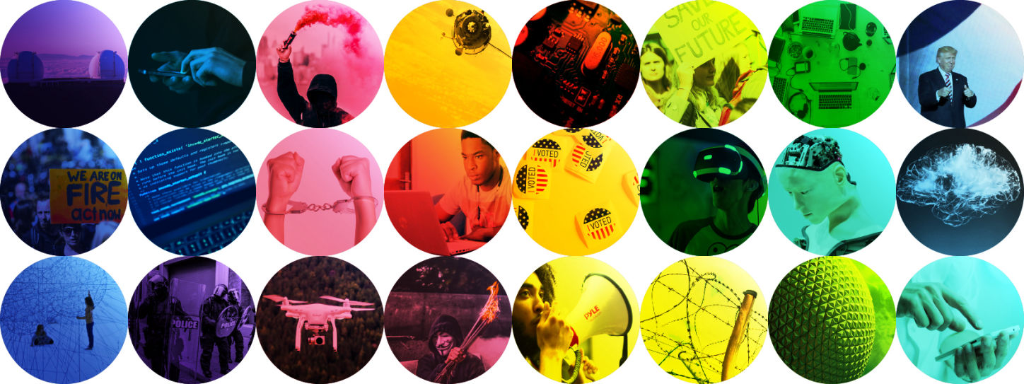
What we want to achieve is a new visual ‘lexicon’ for taking about the myriad issues we work on, rather than relying on old privacy tropes. The essential story we want to tell is not about ‘privacy’ but what privacy enables. it enables democracy. it enables you to define your own identity. it enables freedom. It enables you to be human.
We also want our visual identity to show that the future is unwritten. So while we want to reflect our positive vision for the future with brighter colours, we also want to present visceral ideas about very possible dystopian futures. There are many futures, many possibilities, and we want our visual identity to convey that complex set of possibilities.
We won’t deconstruct and explain every single visual element of our new visual identity, mostly because we’ve been enjoying hearing how different people have found different meanings and symbolism in it, many of which we hadn’t seen ourselves! So we look forward to further interpretions of our new visual identity when we launch it next year!
Our new visual identity is part of a wider process of communicating more viscerally about the diverse issues we work on and what is at stake in a future without privacy. This whole process has invigorated our sense of purpose, and invigorated our commitment to work together with you to hold companies and governments to account.
To be clear, this isn’t radical transformation of our mission. It’s about reconnecting with the mission that we’ve always had. You will soon see more, as we continue this transformation of how we work with you, and how we communicate. We’re looking forward to 2020 and beyond, and shaping a better future with you.